Rooted

Brand identity & development

What's The Problem?

Most popular snacks are filled with ultra-processed ingredients, preservatives, artificial flavoring, seedoils, and chemicals consumers cannot pronounce.Shoppers want clean, recognizable ingredients butfeel overwhelmed, misled, or unsure of which brandsare genuinely healthy.

How might we create a snack brand people cantrust? One that removes confusing labels, artificialingredients, and hidden additives, while still delivering the flavors people love?Rooted addresses the gap between flavorful,craveable snacks and true ingredient transparency.
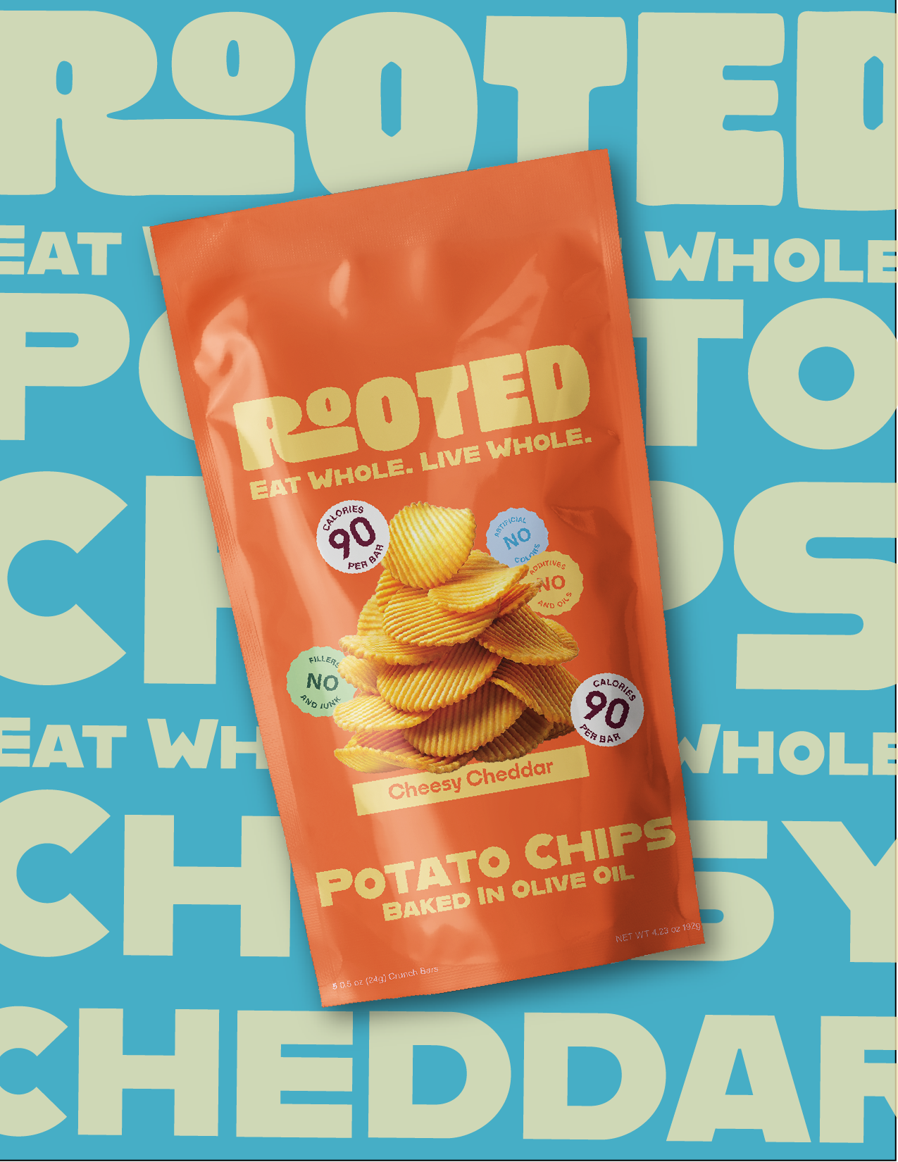
Orange bag of Rooted Cheesy Cheddar potato chips against a blue and beige background with large text. The bag features a stack of ridged chips and claims 90 calories per bar, no artificial colors, no fillers or junk, no additives and oils, and states the chips are baked in olive oil.

Challenges

Many snack brands claim to be healthy while still relying on artificial ingredients, complicated labels, and misleading marketing language. Words like “natural,” “clean,” and “wholesome” are often used in marketing, but the ingredient lists tell a different story. As a result, consumers are frequently left feeling unsure about what they are actually eating and whether the products they are buying truly align with their desire for healthier choices.

The challenge for this project was to design a brand identity and logo that clearly communicates Rooted’s values of transparency, simplicity, and natural ingredients. The visual identity needed to reflect the idea of snacks made from recognizable, whole foods while still feeling modern and appealing in a competitive grocery store environment. With so many snack products competing for attention on shelves, the brand also needed to stand out while maintaining a sense of clarity and honesty.

Other Challenges

Another consideration was avoiding the overly clinical or “medical” aesthetic that many health-focused brands adopt. While the brand promotes healthier choices, I did not want it to feel sterile and overly scientific. Instead, the design needed to feel warm, approachable, and grounded, reinforcing the idea of being connected to real ingredients and real food.

The final goal was to create a visual identity that feels organic, clean, and simple, mirroring the philosophy behind the product itself. Every design decision, from the logo to the broader identity, needed to support the idea that healthy snacking can be straightforward, transparent, and enjoyable.

Results

After extensive research into the values, mission, and purpose of the brand, I developed a brand identity that reflects Rooted’s core philosophy of simplicity, transparency, and trust. The visual system was designed to mirror the idea that snacks should be made from ingredients that are recognizable and uncomplicated.The custom typeface used for the logo incorporates organic, simplified shapes that reflect the natural and grounded qualities of the brand.

The packaging uses bold but minimal color choices to create a strong presence on the shelf while still reinforcing the idea that the products themselves are simple and made from real ingredients. Together, these elements communicate a clear and cohesive brand identity that helps build trust with consumers and reassures them that they can feel confident about where their food is coming from.